tl;dr; version: Get your head out of your ass, stop adding complex features that 90% of the world won’t care for. Instead, learn to stop, breathe, and make your software products simple by focusing on usability consistently.
Users aren’t stupid, your UI is.
In a big bad world of federated software product development, Usability is usually a bullet item way down at the bottom of a list of priorities for anyone but designers, at best. When your entire product team (including designers, developers, qa, etc) lives and breathes a particular software product for a period of months or years, *any* product becomes easy to understand. It’s easy to understand because you’re paid to think about, live, and breathe that product for 8 hours a day or better, for very long periods of time.
It’s no wonder when your amazing product ships and the users come out en masse and tell you what you’ve made is shit in one way or another.. your users don’t get paid to deal with your poor choices, in fact, in many cases, they’ve invested their own money (or at least their time) to endure your lack of focus and attention to detail. A user doesn’t have the time, or take the time to deal with something that’s difficult to understand or work just so.. unless of course, like you, they’re paid to think about, live with, breathe.. your product.
It follows then, that the holy grail of software development is truly internal tooling and products: the users have esoteric problems to solve, they’re paid by the hour to deal with your junk product with zero competition. And, best of all, all that matters is if you can measure the hours saved by converting that insane spreadsheet they were using before into a simple web app for the invoicing department, then you’re a hero. But, internal tooling and products aren’t the real world, and I’d argue that even internal tooling should have the same designer love, care, and attention that something you’d ship externally does (if you can afford it..).
Usability should be the primary concern for everyone involved with your product. That includes parties you’ll usually have to drag kicking and screaming into caring about usability, such as developers, qa personel, and dev managers. There’s always a bit of a trade off between perfect and good-enough, and while requirements estimated to the hour may look great on paper, if the product’s hard to understand on your ship date, what will the green check marks by deadlines buy you then?
So how do we learn about Usability? For starters, I’d highly recommend any or all of the following books, which were recommended to me by mentors and peers:
- Don’t Make Me Think – Steve Krug
- The Design of Everyday Things – Donald Norman
- Tapworthy: Designing Great iPhone Apps – Josh Clark
- The Business of iPad and iPhone Development – Wooldridge and Schneider
If you don’t have the time for books, the roundabout way to learn about usability is to start paying attention to the details in the apps and products you already love. Do you ever automatically attempt to pull a door with a handle, only to discover it pushes instead? Do you have to figure out which step is next in one app, while the next seems to just flow from step to step in an ordered fashion without worry? Have you ever endured godaddy’s checkout process?
Some usability sins are worse than others, but every sin is a chance to pay attention to underlying drivers of your frustration or annoyance. When we notice the design in things, we get a little closer to the zen of appreciation, and we sharpen our usability skills all the while.
More or less: listen to Steve Jobs, go take a walk and think about your product more abstractly; keep things simple, then simplify them again; make the most used bits of the product the easiest to get to, and don’t be afraid to require a little more effort for the less oft-used functionality; usability test with someone who is *not* a coder or designer or paid employee if you can help it; build analytics into your site or app; build easy/great feedback mechanisms right into your product; provide a customer service email or number, make them easy to find, and take every single customer complaint or criticism to heart.
Knowing usability in theory will not be enough, it’s nigh impossible to disassociate yourself enough from a product you’ve lived and breathed to understand the flaws in your immaculate design. And, if you can achieve the zen master state of dissociative “new user” nirvana, you’ll never be an idiot user.
Who or what is an “idiot user”?
An idiot user is 90% of your user base. That is, someone who is using your software to do something they want or need to do. They have zero interest in “learning” for your product to be useful, and they have an equal amount of interest in figuring out all the neat whiz-bang things your product can do. If they have to think about your software, your software has failed, and some poor techie in the family or IT dept is getting a phone call. It’s as simple as that.
Fun fact, did you know the #1 search term on google is almost always the phrase “yahoo”? Think about the implications of this for a moment. This means *most* (i dare say: the vast majority of..) users are opening their browsers, seeing the google web page, and typing “yahoo” to get to their mail and entertainment news. This means *most* users do not know what an address bar is, or what a url is, or that a browser has some hidden feature to make yahoo their starting page. This is your idiot user.
Nice-guy analysts will tell you users aren’t as dumb as the numbers suggest, people have just defaulted to using the search bar rather than the address bar because it’s quicker. I call bullshit, because I’ve seen it, and surely you have too. Why should our non-technical friends or family know or care about a default starting page in a browser, or an address bar that only shows them errors rather than guesses at the correct answers for them? It frustrates us techies to no end to say for the millionth time “Stop clicking on attachments!!!”, but the truth of the matter is simple: software is not yet user-friendly or simple enough.
It’s getting there: a 4 year old can use an iPad without being able to read, your mother in law can find and play any number of amazing casual games online on facebook with her friends and family, world of warcraft style. But we’re not there yet, especially as long as you and I keep making crap software where usability is a “maybe” priority at best.
Another fun fact: you and I are idiot users, too. Remember your first time trying to find the network preferences pane in your new shiny Vista or Windows 7 install after years of the Win9X control panel layout? Ever tried to make sense of iMovie ’11+? The fundamental difference between idiot users and idiot techie users is that idiot techie users have the patience, curiosity, or perhaps control issues that allow them to quickly try-discover-fail-and-iterate. The real question is perhaps, which user is really the idiot, the one who fails fast and gives up, or the one who deals with the absurdity of our software complexity and therefore continues the cycle?
So what does usability mean in the real world? A small example:
My buddies and I created TumbleOn, a photo viewing app for photos from Tumblr.
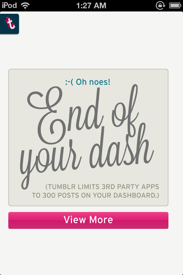
When we started making TumbleOn, every Tumblr photo app we could find made it nigh impossible to quickly view photos in a simple stream view. Most apps only allowed users to view their “dashboard” (like the news feed on facebook), and nothing more. Tumblr limits the dashboard to 300 posts total, so that gave us an easy metric to time: “how long does it take to see all 300 photos in these other apps?” answer: 5-10+ minutes depending on the app. Answer in tumbleon? 1 to 3 minutes on average. Success! … or so we thought.
We released TumbleOn, dreaming of riches, and picturing ourselves heroes for blessing the world with time savings on their dashboard. Then the feedback started to come. Users found bugs, they had crazy ideas, and good ones, but one comment we consistently received was “I want to see more photos on my dashboard!”.
Our app made it possible for 90% of the users to reach the end of the dashboard, where other apps were so limiting that perhaps 10% of the users would spend the in-app time and effort to ever hit the end, and yet our users were complaining! The nerve! This was not success, this was a usability failure.
Being smart little college-educated developers and designers, we set out to solve this usability problem in one of those esoteric and too-technical ways that only college-educated developers can: we added complicated features that nobody understood, and made the problem worse.
We added a nifty “analysis” feature, which analyzes a user’s posts on their dashboard and shows blogs the images come from, so the user can easily go view more or perhaps discover a new blog they’ll like. We added the feature, made it almost impossible to find, along with a few other new features, and patted ourselves on the back for another release.. heroes again, this time, surely, triumphant! Just look how smart we are, look at our neat new complex analysis feature and behold its glory, if you can find it, mere mortal!
Another cycle of complaints and confusion later, we made a little hint auto-popup to show users where we hid these treasures in the app. Even so the analytics showed abysmal numbers, for every 100,000 dashboard views, perhaps 100 analysis events would happen.. the top percent of a percent of our users even knew or comprehended what analysis was, in other words: the techies understood, and 90% of our user base thought we were out-of-touch idiots, rightfully so.
We then put the 300-post-limit usability issue on the backburner, essentially accepting defeat. We added some foot notes to in-app help documents that users never read. We also added a video about the features that users never watch (statistically speaking), because that video is also buried in the in-app help system. Users don’t have time for a 3 minute video, they use the app for less than 3 minutes on average as it is.
A few months passed and for whatever reason this review sparked a flood of the-right-way-to-do-it ideas from our subconscious:
The idea was simple, which is a sure sign you’re on the right track in terms of usability or anything to do with software development really. We simply needed to make it easier for users to use the analyze feature, without even requiring a super technical understanding of what post analysis meant. We added a “view more” button at the end of a photo stream, changed our verbiage about why the dashboard ended, and provided simplified “view top 10 xyz” views into the analysis data, like this:
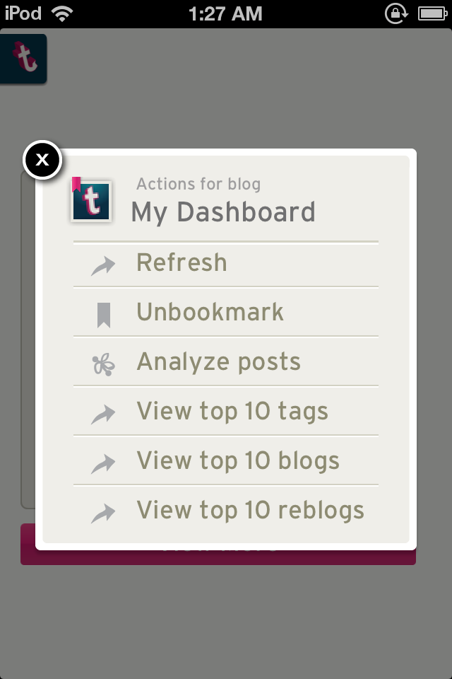
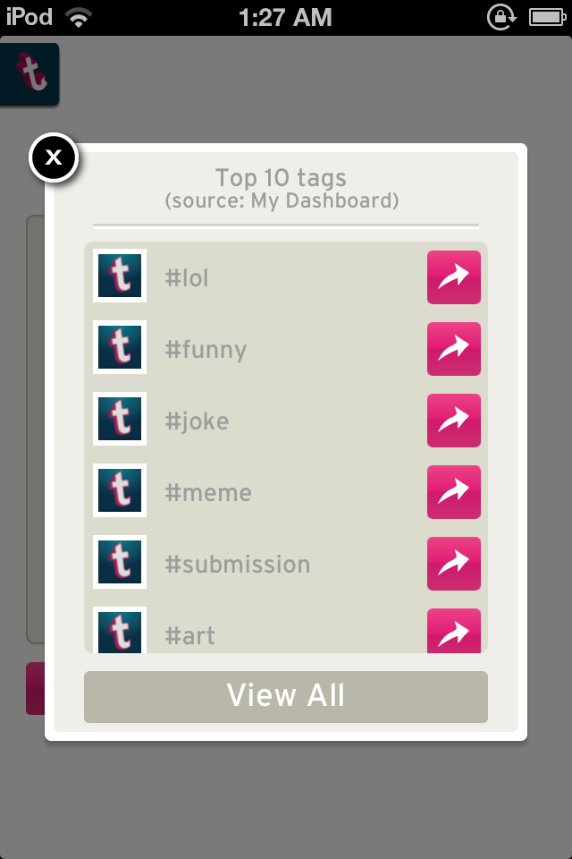
Results? Between the verbiage and the view more options, we’ve done something right, because users no longer complain about the dashboard limit or perceived shortness. The users simply click “view more”, find something related to what they just saw, and almost instantly fall into a #lol tag with thousands of posts. They don’t even see or consider the “analyze posts” or other 5 options shown in the popup above, they see what they want, and go for it.
Are more users finding and understanding the “proper” analysis feature after our improvements? Not really. And that’s okay, because thousands more users are using the feature without even knowing it, because that’s how great software design works: as if it were transparent.
Great software is transparent to the user. It’s not about someone using your app, hitting the fourth wall and thinking “gosh, the software team behind this must be really really smart, it’s so complex!”. What sells is sparkle, shine, animations, and fundamentally transparent design. The shine will get them in the door, the transparent “it just works” attitude will keep them coming back for more.
Sometimes the first, second, or even the third version of your feature is not the feature that ultimately works, but taking the time to mentally iterate on an idea using quick wire frames will go a long way toward the product you truly want to deliver. For wire frames, I recommend pencil and paper (an idiot user’s choice) in a meeting with designers and developers actively involved, or something like balsamiq if you really must have a fancy tool (you idiot techie user, you..).
Getting from “neat” to “transparent” isn’t easy, because it requires us to be still, and simple. Creative professionals want to create, not philosophize, but fundamentally that’s exactly what Usability is all about: a philosophy of slowing down the feature cram-fest and spending a few more cycles iterating on simplification. We want to create the next hacker news worthy big thing with some esoteric and exceedingly complex technical feat that less than 1% of the users in the world will understand, but we need to learn to force ourselves to remember that the #1 search term in the world, 24/7/365 is the term “yahoo”. Your users don’t need analysis features that take 3 paragraphs of help documentation to explain, they just need “view top 10 xyz”.
“There aren’t stupid users, only stupid user interfaces.” – A great designer I know.